Post by Garra Desalmados on Feb 10, 2013 4:27:22 GMT -5
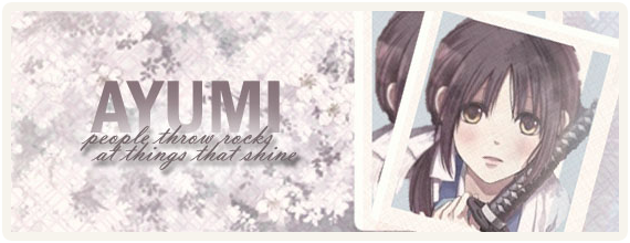
None of them. They're all too tall and would be an obstruction to forum flow, I would advise you to reduce the image height to around 200 at most and to also have a signature that is larger horizontally than vertically. Otherwise it'll have to go in a spoiler, such as Ken's signature. Not to be rude, but I just think this information would be worth conveying and worth note.
Although out of the options, I would say the last one, once sized more appropriately, would be the best because its not as blurry as the others and the inverted color-scheme of the first just doesn't look good to most people (generally speaking, inverted colors aren't useful for most things that you want to be visually appealing and which will exist for longer than a few frames.)
Post by Takasugi Ayumi on Feb 10, 2013 6:23:24 GMT -5
I'm in agreement with Garra--the sigs are both too tall and too wide. An appropriate height would be 550x150, but don't go over 200 height-wise.
Also, as for the sig itself, I would go with the fourth one though the colour choice and scheme is too bright for my liking and I don't particularly like the grainy/noisy texture either.